GradLeaders Career Center – Admin Usability Upgrades May 4, 2020
Multi-Window / Multi-Tab Capability
- Users will be able to right-click and ‘open in new tab' for all menu options and navigation links in the system.
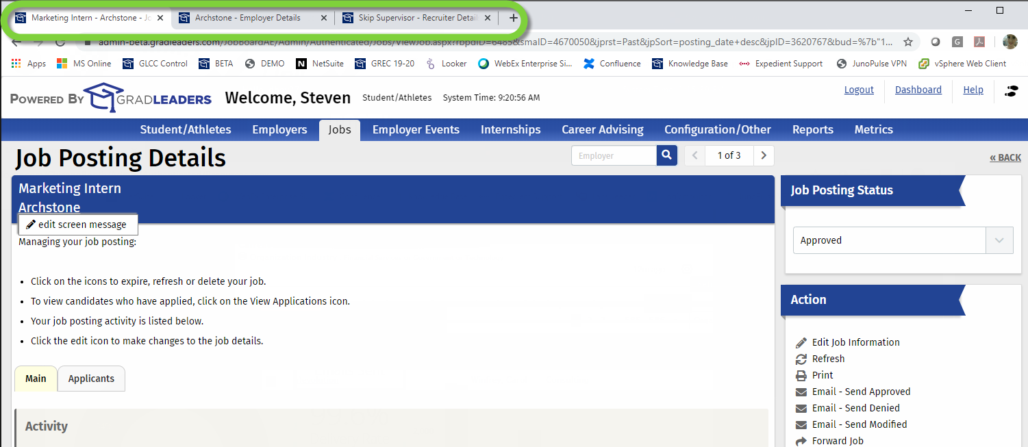
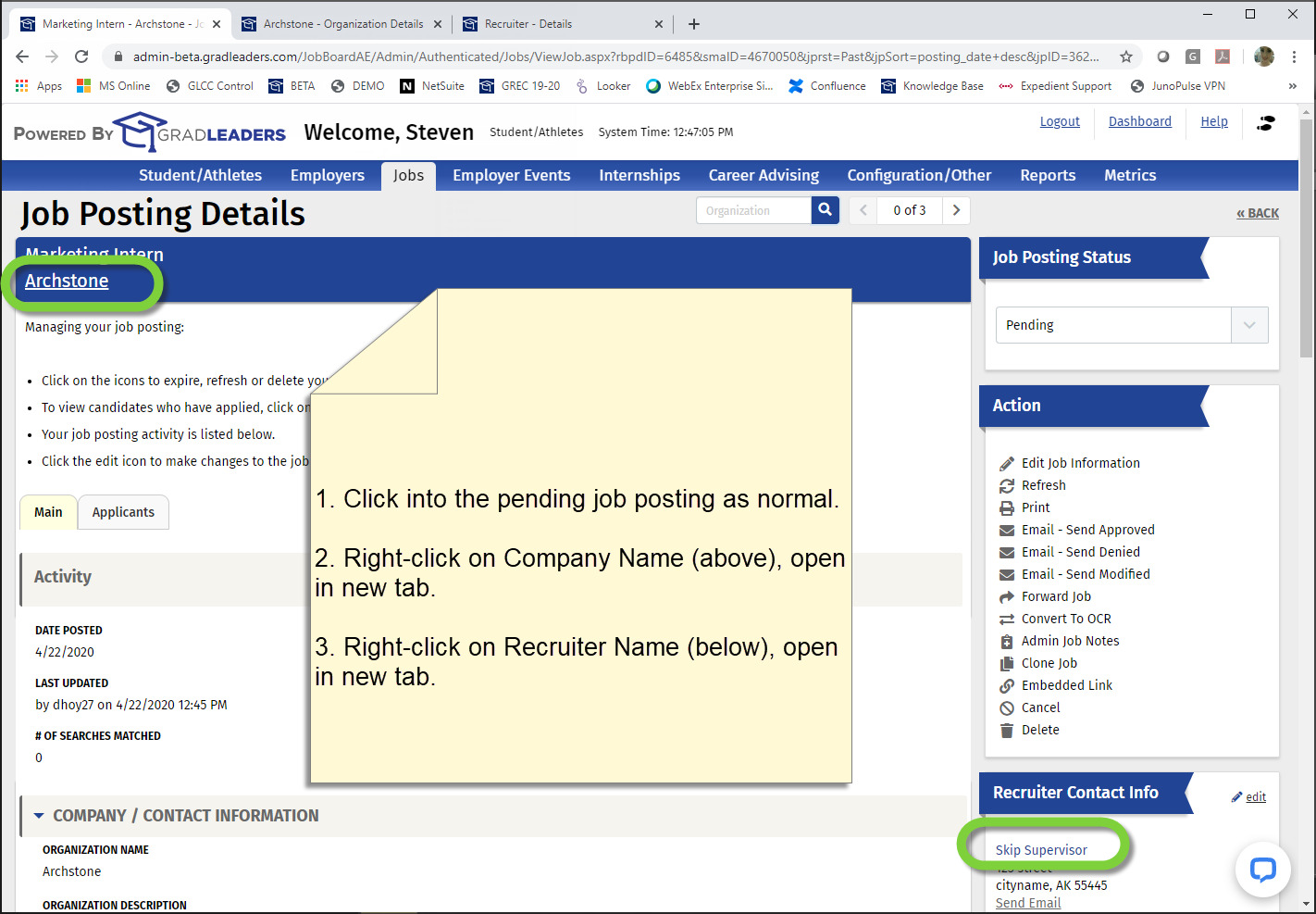
- Tab title updates - the browser tab name will now reflect most entity records. (Example: On the Archstone company record, the tab name will now be "Archstone")

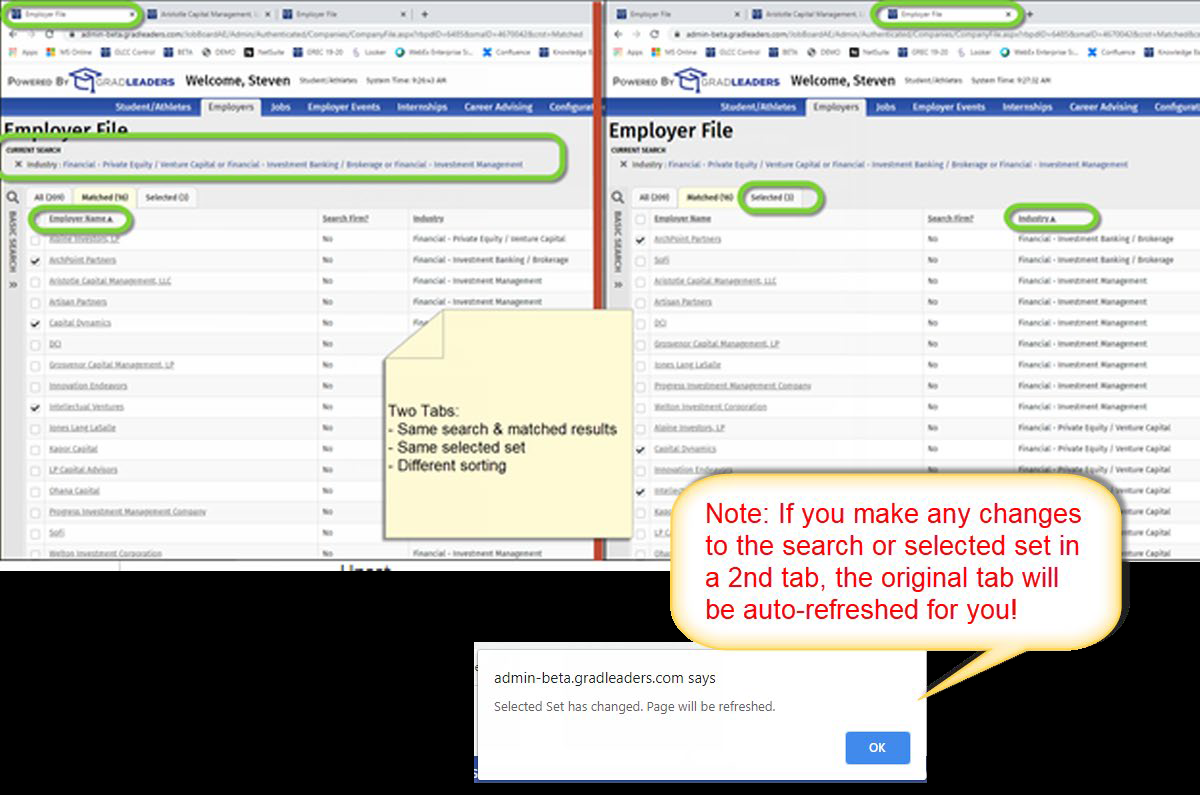
- There will be a single current search (and matching search results) per entity (Candidate, Company, Job, etc.) for a user, across all of their admin system tabs.
- There will be a single selected set per entity for a user, across all of their admin system tabs.
- Opening grid pages (Example: Candidate File) in new windows will reset any Sort and Result Sets back to default. This allows 2 different grids in 2 different tabs to have different sorts

- Best practices use cases for multi-window are detailed at the end of this document
- Bear in mind that you will find that a small subset of the action links do not have the right-click enabled. These types of actions are dependent on functionality in the current page. Examples of these actions include ‘Email', ‘Delete', ‘Print Resume'.
Menu Improvements
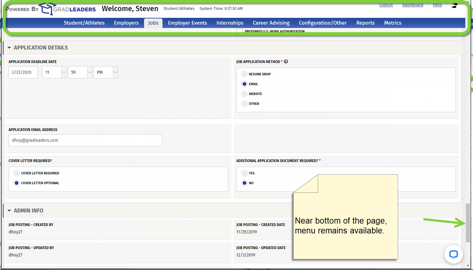
- The Admin menu is now docked to the top of the page. No more scrolling up to get back to the navigation menu!

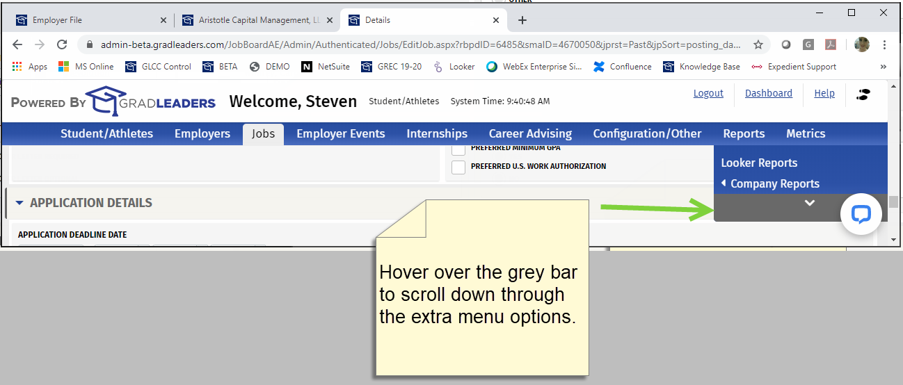
- If there are too many options in a menu to list on the visible area of the screen, an "overflow" menu will appear. Hovering on Up or Down will scroll the extra menus. This will help navigation on smaller screens.

Select Student Page Enhancements
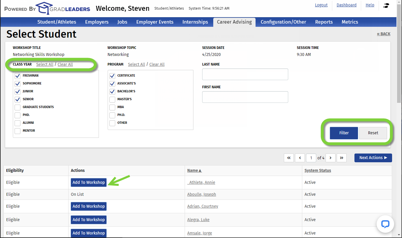
- "Clear" button has been replaced with "Reset", which resets the search to its default. Default is unchanged: it is based on the Eligible Class Year/Classification and Eligible Program/Degree for the event/job/etc.
- Class Year and Program now have a "Select All/Clear All" option
- "First Name" and "Last Name" now have a target set for hitting the Enter/Return key on the keyboard. When hitting Enter/Return, it will execute the "Filter" button.
- The "Add Candidate" have been changed to a button style for improved visibility

General Usability
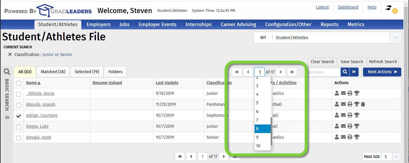
- Page selection – select or type in which page you would like to jump to, instead of clicking “Next” repeatedly.

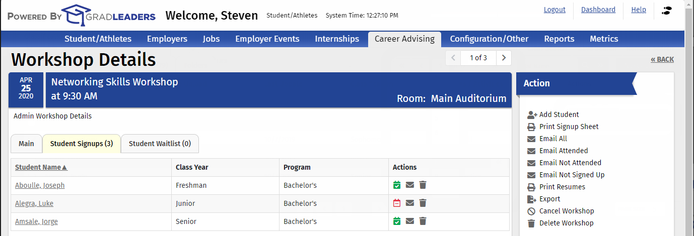
- Attendance Icons have color (green and red) for improved discernability.

- Signing in as a Candidate or Recruiter will now have an animated spinner to give you feedback.

- When your session expires and you are logged out of the system, you will no longer just land on the dashboard when you log back in, but rather land you on the last page you visited.
- You can now just copy / paste a URL and send it to another admin user, provided that the other person has the permissions to view that page. Similarly, these pages can all be bookmarked for later use.
- Dashboard loading times have been improved.
Multi-Window Best Practice Use Cases
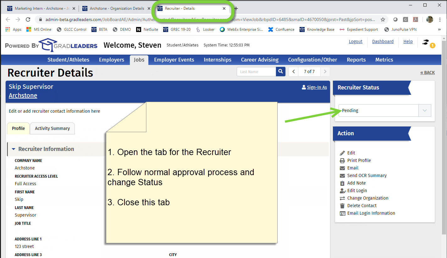
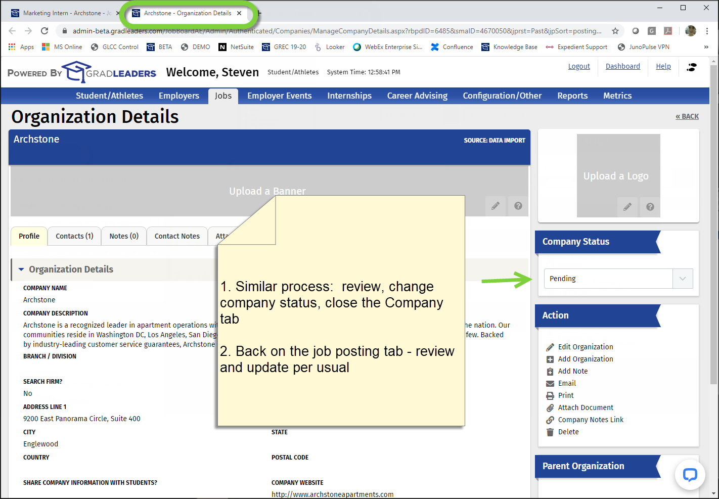
1. Approving Jobs, Recruiter Contacts and Companies. Many schools have all new company, recruiter contacts, and job postings that are input by employers default to a ‘Pending' status. All 3 must be approved before becoming visible to students.


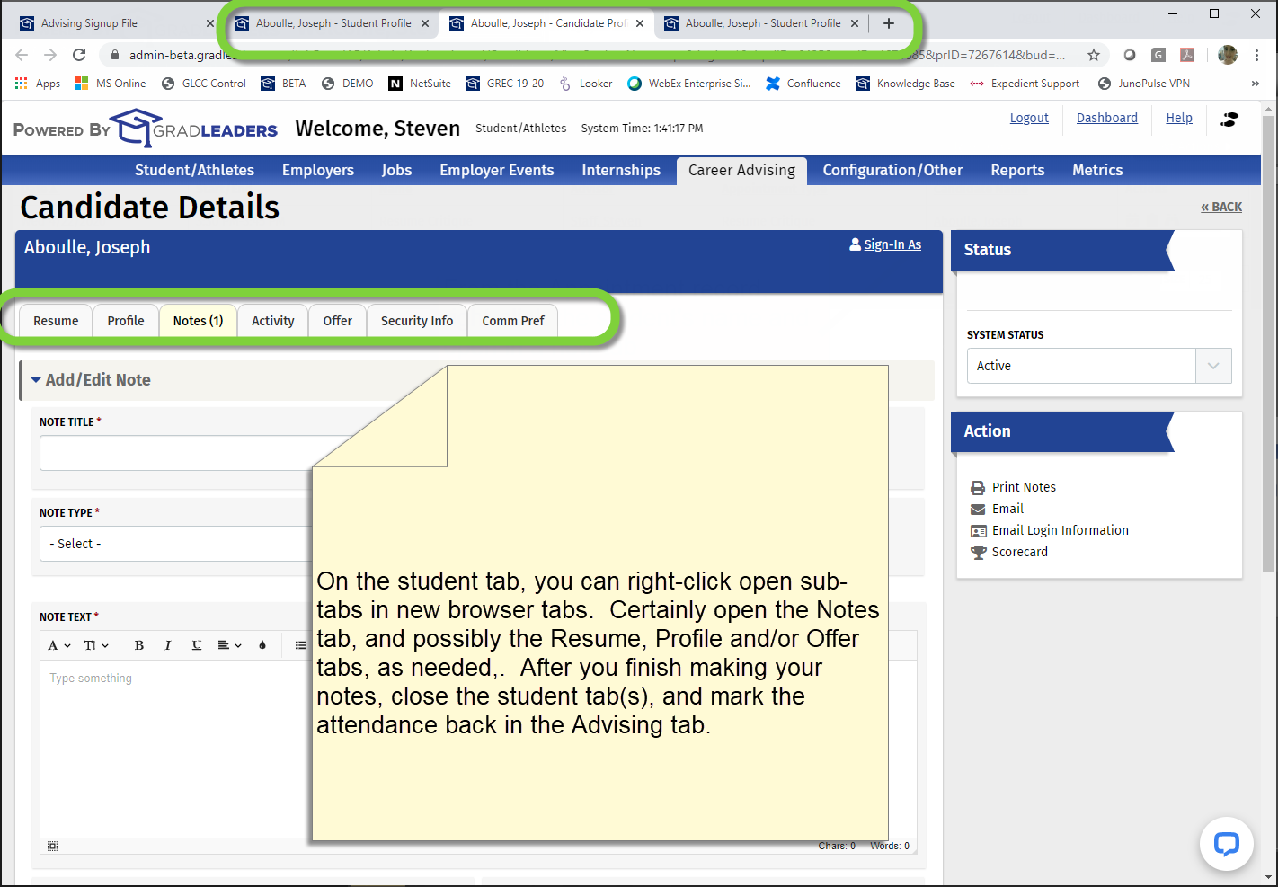
2. Managing Coaching / Advising schedules. The screens below show the process for our Appointment Blocks module, but the same concepts apply to the legacy Advising schedule as well.


There are many other places in your day-to-day use of the system where you will find multi-window processing useful. Perhaps with Job Offers, On-Campus Interviews, and many other places. If you invent a great process, please share it with your GradLeaders contact!
Article ID: 3501
Created On: Jun 6, 2020 at 2:25 AM
Last Updated On: Jun 6, 2020 at 2:25 AM
Authored by: Eddie Thomas
Online URL: http://kbint.gradleaders.com/article.php?id=3501
